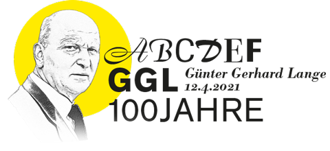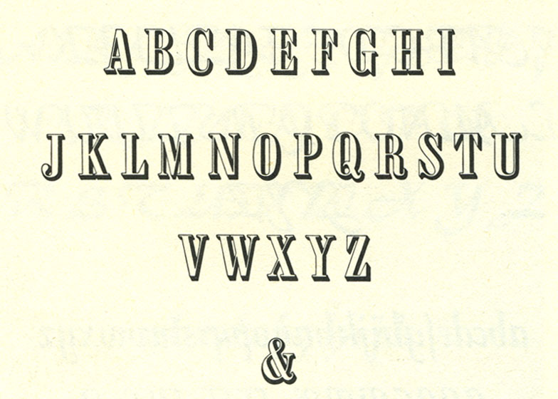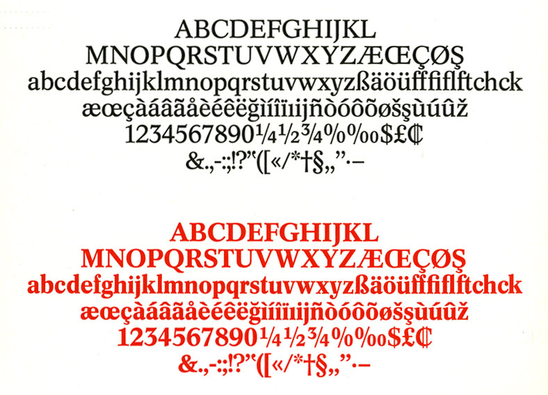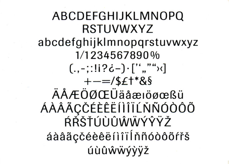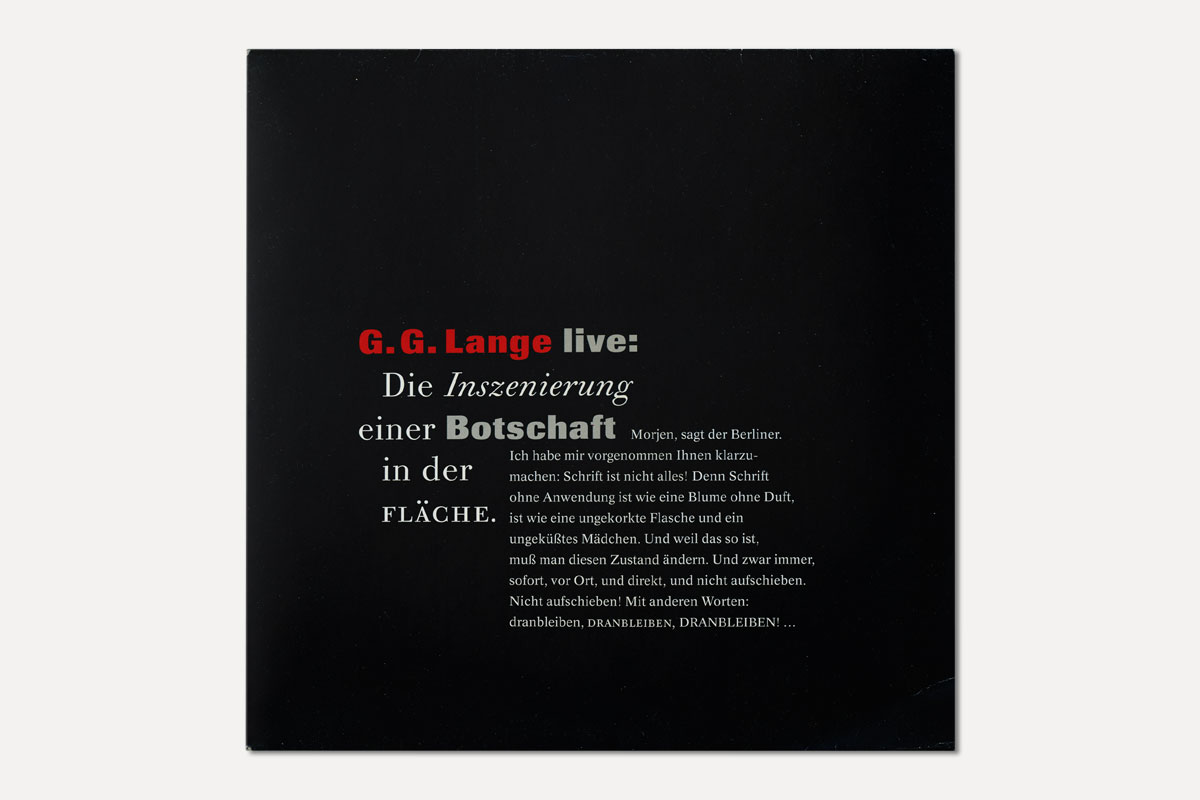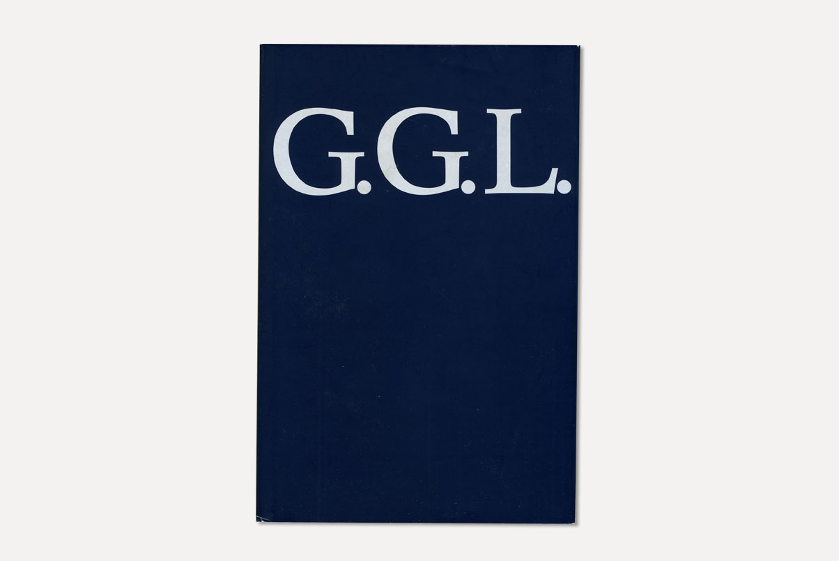
Günter Gerhard Lange’s typographic work cannot be expressed in numbers. As Art Director he is responsible for the complete oeuvre of H. Berthold’s fonts. During the first years he creates lead type fonts for advertising purposes, among them Derby, Solemnis, Boulevard, Regina, Champion and, as the first set typeface, the Arena. Because GGL wanted Berthold to get ready also for machine setting. Next to his original fonts, his most valuable contribution, from a typeface-historical point of view, is the elevation of traditional established lead typefaces and their transformation into photo typesetting and the generation of digital characters. A selection of his own fonts is presented here.
Arena

The Arena, a semibold, universally usable and narrow running Antiqua with a strong ductus is GGL’s first font design for H. Berthold AG. This semi-bold markup font, originally intended to be a standalone version, was created in 1951. A year later, in 1952, it was extended by the basic font Arena, in 1954 by the Arena Italics and finally, in 1959 by the Arena Italics semi-bold. A revised and extended version of Arena, drawn by Dieter Hofrichter under GGL’s supervision, appeared in 1991 as Arena New with eight typefaces.
Boulevard
The Boulevard is a handwriting font based on the principle of the English handwriting, avoiding its weaknesses from a technical point of view. It was cast completely without overhangs and has no connections. The calligraphic character of this font is supported through ligatures and some end pull letters. The Boulevard was cut in eight typefaces from 12 to 60 point.
Regina
The H. Berthold AG type foundry developed this light, shaded versal script as a house font, created by GGL as a decorative alternative to the Normande. Berthold promotes the Regina for use on book and magazine titles, on calendars, modern brochures and elegant business print matters, also in combination with handwriting and other writing characters. It was produced in 1954 in 16 to 60 point.
Concorde

The Concorde is a newspaper font, which initially appeard in 1969 in the sets plain, italics and semibold. It was developed by Günter Gerhard Lange in cooperation with the Studio of Harris-Intertype in Berlin. The font is identical in shape and thickness in the systems Staromat, Starsettograph, Diatype, Diatronic and on the Phototronic typesetting machine of Intertype. Moreover, it matched in lead and photo typesetting. The Concord was not only meant as an alternative newspaper font to the all-dominant Times, but first and foremost it was created as a better match for the technical requirements of rotary printing.
Akzidenz-Grotesk

Bodoni Old Face
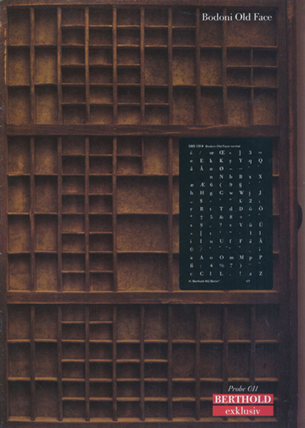
The creation of the Bodoni Old Face was preceded by the analysis of a large number of original Bodoni prints in the breadcrumb area (font sizes between 6 and 10 point). Although clearly different from the other font styles, it is nevertheless strictly committed to the Bodoni Originals. It appeared in 1983 in eight font styles for photo typesetting and was enlarged in 2001 by Bodoni Old Face Small Caps semibold and Italic, and Bodoni Old Face Small Caps bold and Italic.
“(…) The Bodoni Old Face is my discovery. A bibliophile stroke of luck, which, looking through my books, literally hit me in the face. No other font manufacturer has this Bodoni variant. (…)”
Günter Gerhard Lange, Typografische Monatsblätter 2.2003
Imago
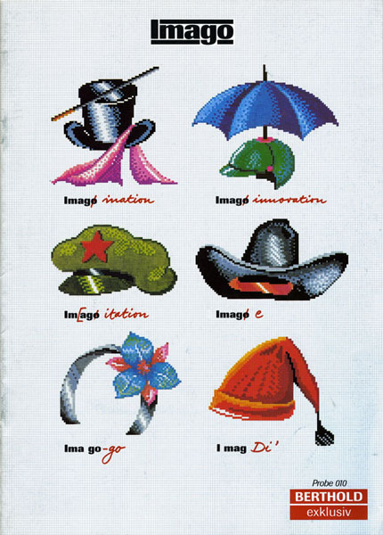
The Imago is a sans serif Linear-Antiqua with a classicistic character, designed by Günter Gerhard Lange in eight font styles and published in 1982 by H. Berthold for photo typesetting. It follows in the tradition of the grotesque fonts around the turn of the century, e.g. the Kompakt Grotesk (1893) by the Haas type foundry, the Akzidenz Grotesk (1998) by H. Berthold AG or the Univers (1957) by Adrian Frutiger. The Berthold Imago presents a great consistency from character to character and from font to font. In 2000 it was supplemented by the fonts Imago fat and italics and small caps for all styles.
Literature
-
Philipp Luidl [Ed.]: G.G.L.: Günter Gerhard Lange. Zusammensgestellt, herausgegeben und Günter Gerhard Lange gewidmet von Philipp Luidl. Munich: Typographische Gesellschaft München, 1983.
-
Philipp Th. Bertheau [Ed.]: Buchdruckschriften im 20. Jahrhundert: Atlas zur Geschichte der Schrift. Darmstadt: Technische Hochschule, 1995.
-
Yvonne Schwemer-Scheddin: “Gelebtes Leben ist gelebte Schrift”. In: Deutscher Drucker, Nr. 17, 2. May 1991. pp.g34 – g36.
-
Yvonne Schwemer-Scheddin: “Ein azyklischer Geburtstagsgruß”. In: vier Seiten, Mitteilungen der Typographischen Gesellschaft München e.V., Ausgabe 17, March 2002. pp.1–2.
-
Typografische Monatsblätter, 71. Jahrgang, Heft 2. Special issue Günter Gerhard Lange. Zurich, 2.2003.
-
Yvonne Schwemer-Scheddin: “Schrift, die spröde Geliebte – verlassen”. In: vier Seiten, Mitteilungen der Typographischen Gesellschaft e.V.,Ausgabe 39, March 2009. pp.1–3.
-
Wolfgang Beinert: Lange, Günter Gerhard. In: Typolexikon.de, Das Lexikon der Typografie. Online available https://www.typolexikon.de/lange-guenter-gerhard/, accessed on march 31 2021.
Illustrations
-
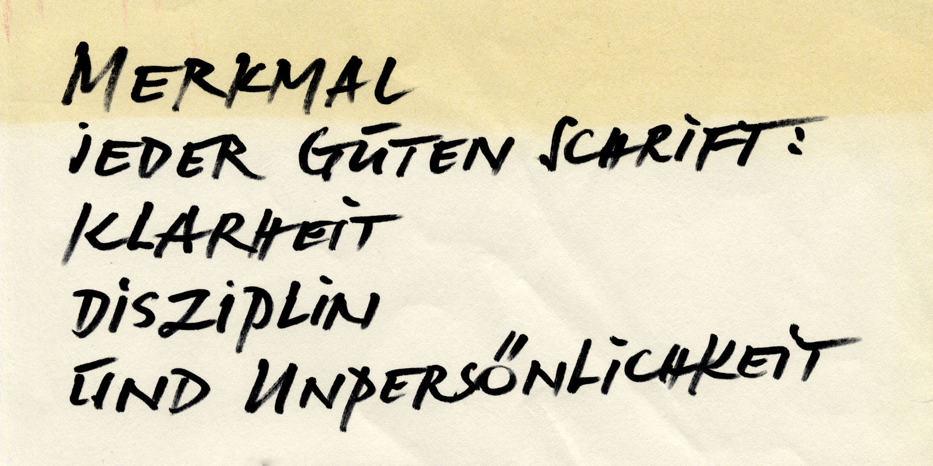
Handwritten quote GGL, collection Kirsten Solveig Schneider
-
Arena, Boulevard, Concorde, Akzidenz-Grotesk: specimen Nr. 476: Berthold-Schriften / Caractéres Berthold / Tipos Berthold / Berthold Types, undated [ca. 1970]
-
Arena: Berthold Specimen No. 543, undated
-
Alphabet Arena, Boulevard, Regina: Philipp Luidl [Hrsg.]: “G.G.L.”, 1983
-
Concorde: type “Weshalb ist die neu Antiqua Concorde von Berthold …”, undated [around 1969]
-
Akzidenz-Grotesk: AG leaflet “drei mal pro”, undated
-
Akzidenz-Grotesk Alphabet: Berthold exklusiv Probe 013, undated
-
All illustrations Bodoni Old Face: Berthold exklusiv Probe 011, undated
-
Alle illustrations Imago: Berthold exklusiv Probe 010, undated
