Eckehart SchumacherGebler
It is a while …
It is a while since we met for the first time. I had just opened a typesetting studio in Munich, with the Folio and other fonts from the Bauer typefoundry. Later I added the Helvetica, without which one didn’t stand a chance with advertising agancies. These two fonts made me want to also have the third great sans serif in my type cases, the Akzidenz-Grotesk of the H. Berthold foundry in Berlin. It was the start of a close relationship with this traditional establishment. And with Günter Gerhard Lange, who had been working there freelance since 1950. There was enough work waiting for him. The company was just beginning to recover from the aftermath of the post-war period. New brochures needed to be designed, the advertising business wanted contemporary fonts which had to be created. And Lange was the man to tackle those jobs.
1951 saw the birth of the “Arena”, quickly followed by a series of writing fonts with calligraphic character. The start was “Derby” in 1952, followed by “Solemnis” (1953), “Boulevard” (1954) and the “Regina”, a narrow, shaded, classicistic Antiqua, presumably intended as a completion to the styles of the “Normande”. After a short pause the “Champion” (1957) and somewhat later the “El Greco” (1964). All in all, a remarkable achievement.
At this time, Berthold was looking into the future, recognising phototypesetting as the coming technology. At the 1958 drupa the time had come and the Diatype could be presented for the first time. The experts reacted with caution. Intensive persuasion was needed. Lange did not hide in his ivory tower. He travelled halfway around the world, with eloquent appearances at trade fairs and other professional events, giving lectures and writing articles for trade journals. This got him the nickname of “Gutenberg’s Machine Gun”. With this mission he also visited us. His arguments were convincing, and it didn’t take long before we had two Diatype machines in our studio.
From the following time there are two fonts which need to be mentioned: the “Concorde” and the “Bodoni Old Face”. The first was a counterpart to the “Times” and resulted from the cooperation with Intertype, who didn’t have the legal rights to this universal font. It was different with the Bodoni. This resulted from the intention to create a replica as close as possible to Italian writing. GGL brought original prints to the studio of Bernd Möllenstädt, the head of the company, and every detail of every single type was thoroughly discussed. There were no drawings, Möllenstädt once called him a “verbal designer”. The results from this way of designing, however, are convincing.
While our acquaintance had started with a special subject, our friendship of many years usually also ended up with typography, writing and writing history. One reason was that we both were members of a number of associations: TGM, ATypl, Type Directors Club and others. Several projects for those organisations, book editions for the TGM, the Annual General Meeting of the ATypl 1980 in Munich, and not least the exhibitions in our company were prepared and implemented together. His opening speeches and lectures were unforgettable; vehement, spirited and sometimes a touch aggressive, when Günter had enjoyed a little too much of the welcoming wine.
Looking at the life of GGL, the question inevitably arises: how did this extraordinary development happen? Quite certainly it was his early fascination for type design and maybe a coincidence – if there are such things as coincidences. In a conversation he told how, as a schoolboy in his home town Frankfurt an der Oder, he saw, in a display case of the renowned printing company Trowitzsch & Sohn – who until 1897 owned the Unger matrices – a calligraphic sheet, and in this way he came into contact with typography. Seeing this sheet with type designs turned out to be a key experience for him. He was so impressed by it that with the help of a packet of cigarettes he persuaded the doorman to let him into the house, where he wanted to meet the originator of this sheet. Flattered to have his work admired, this man showed the boy around and finally ended up in the typesetting shop. The typesetter also liked the bright boy and asked whether he wouldn’t want to work here, too. The condition was that he strictly kept to the same hours as the others – from half past six till quarter to five.
At the beginning of the Second World War, GGL volunteered and was drafted in October 1939. He thus belonged to those cohorts who had to mourn the most dead and wounded. Günter Gerhard Lange survived, but perhaps only because he was wounded in July 1940.
In spite of losing a leg he did not give up, at that time he was physically a very fit young man. He went to Leipzig and became a master student at the Akademie für Graphische Künste und Buchgewerbe (academy for graphic design and book trade), studied calligraphy, typesetting and printing with Prof. Georg Belwe, who nowadays is hardly remembered, just like his typefaces, e.g. the Belwe-Antiqua. Later on he was assistant to the highly esteemed Walter Tiemann, the grandseigneur of typography, whose typefaces – Orpheus, Euphorion, Tiemann-Mediäval still exist in our Offizin Haag-Drugulin. The increasingly entrenched political system, however, gave him a hard time. For a man like Lange, who did not mince his words, conflicts could not be avoided. He went to Berlin. He went to Berthold.
He was accompanied by a world which he himself sustainably marked and helped to shape. A world which one cannot simply enter and conquer for oneself. No, it needs to be carefully opened up and be courted in trying to win it over. The metaphor for type as an initially brittle mistress was coined by Lange himself. Only to those who perceive and recognise her inner beauty, her charms, to the full extent, and who give themselves to her with all their heart, to those she will open herself with all her tenderness, never to let them go again, to cast her spell on them forever.
Eckehart SchumacherGebler
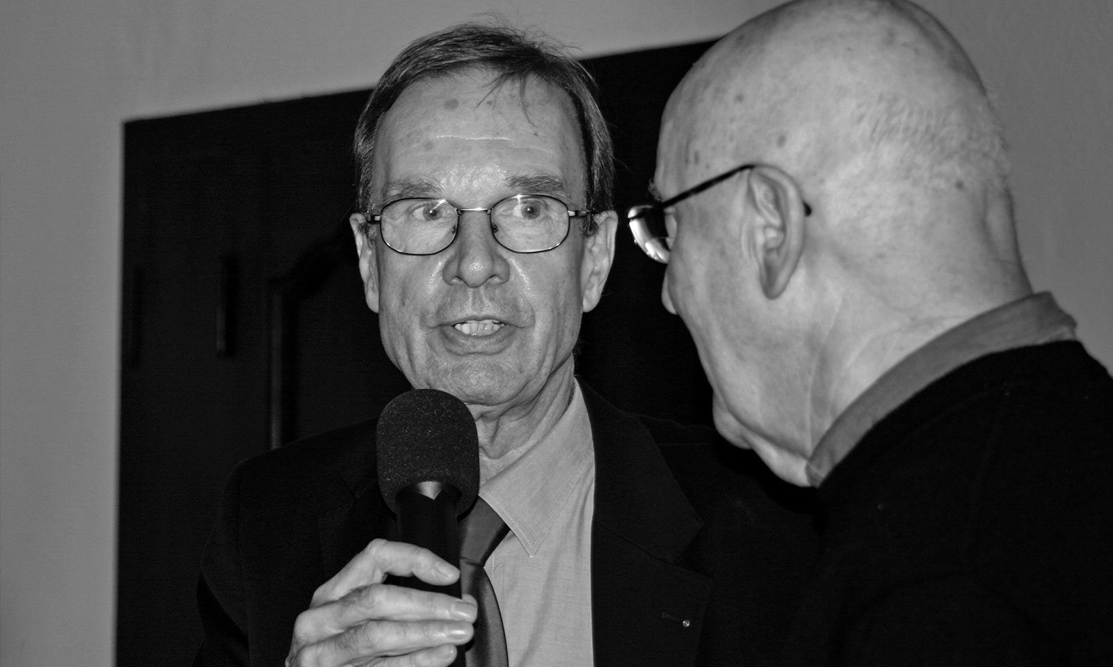
Eckehart SchumacherGebler and Günter Gerhard Lange, Typotage Leipzig 2004.
Photo: Michi Bundscherer


