Volker Schnebel
Development of the FAZ Gothic
Headline Font for Commentary and Glossary of the “Frankfurter Allgemeine”
G.G. Lange was a star in his time. It was the era of photo typesetting and in contrast to today it involved many people before, with great effort, a single cut could be exposed on a photo set plate. At the top was G.G. Lange, the Art Director of Berthold. His main task was converting the classics from lead type to photo typesetting. His drawings of those revisions are legendary.
I knew him from many Atypl seminars where he regularly gave acclaimed lectures, which often dealt with the complicated and adventurous lives of historic typographers.
When, in 1999, I had failed in my attempts – together with the Graphic Director of the FAZ, J. Jansen – to develop a new Gothic font for the Frankfurter Allgemeine Zeitung and didn’t make any progress, there was hardly anybody else in Germany whom we could ask for help except for G.G. Lange. He was nearly eighty then, but sprightly and full of beans, and he really came to Hamburg for a week, where we put him up in a comfortable hotel. He was famous for his large library of font samples, and so he brought us, at his first visit, a print of the “Gronau Fraktur”, which he had dug up from his archive. The minuscules were not so much the problem, he said, but for the capital letters we should take the Gronau as a pattern. The ornamental strokes, which Jansen and I had taken out to make the font more “modern”, had to be put in again, and the lower ornamental curves, which he called Elephants’ trunks, would have to be capped.
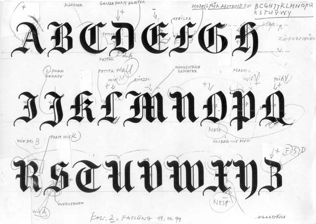
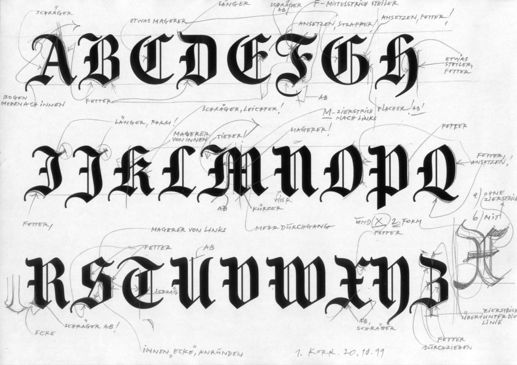
After he had left I worked through the night, and when he came back the next morning he was quite amazed because I already had all capitals of the Gronau, in pure character quality and digitalized, ready for printing. For me what followed was a most instructive period of further development, lasting about a month and always following the same pattern: I made prints of the actual drawings, singly with a height of about 2 cm, but also in 10 pt text. These he took back with him to the hotel, returning them the following day with his corrections. We discussed the alterations, I implemented them and took the new prints to the hotel. Later on, after his return to Munich, we mailed him the prints. It was important to him that I always printed at least double the number of the 2 cm letters, because then he could cut them up and paste parts of them on to other letters. In this way we first of all worked on the capitals, later on the minuscules, where in the end we also changed quite a bit, and finally on the numbers, which don’t exist in Gothic and have to be executed in classicistic style.
During this short time we cooperated in great harmony and mutual respect. He called me “Meister” and “Sehr geehrter Herr” (dear Sir) and it would never have occurred to him to be on Christian name terms with me. This, however, did not strain our relationship, on the contrary, it emphasized the high expectations each of us had of himself. I owe him a lot.
Volker Schnebel, 2021
